Tuesday, 29 May 2012
Magazine Analysis (Females)
The type of women who would read this magazine is women aged 18-26, who are interested in fashion, who are interested in Kate's 10 ten piece honeymoon wardrobe and women who want to know more about the royal wedding. I know these because it shows us these on the front cover of the magazine. The masthead is Grazia; the font is bold on some sides of the letters and thin on some sides. The name is Grazia and its unique, it’s a Italian word, the masthead is Italian to show use of another language and that is more attention seeking because people don’t know the meaning of the word. There are a lot of bright colours used to attract the audience to buy the magazine. In the main image Kate Perry doesn’t look straight so there’s no eye contact with the audience. There are a few sell lines and an example of this is “Kates 10 piece honeymoon wardrobe” and that attracts the audience because the audience for this type of magazine is interested in gossip and want to know more about things. Each font is different, in size(some large, some small), in colour and font type, this makes the magazine look messy as it is aimed for people who are busy and don’t have much time to read a really long column. It is also there for the readers to know what will be in the magazine. The size for some sell are small and some are large, this is because they tried to fit everything in one page but also the readers will come close to read the small sell lines and will be interested to buy the magazine. The colour scheme is bright colours and orange because it stands out from the rest of the magazines on the shelves in the shops. The layout is crowded and layered with the images, sell lines and the main image. The mode of address isn’t that direct because Kate Perry (main image) isn’t making eye contact with the audience.
Tuesday, 22 May 2012
Tuesday, 31 January 2012
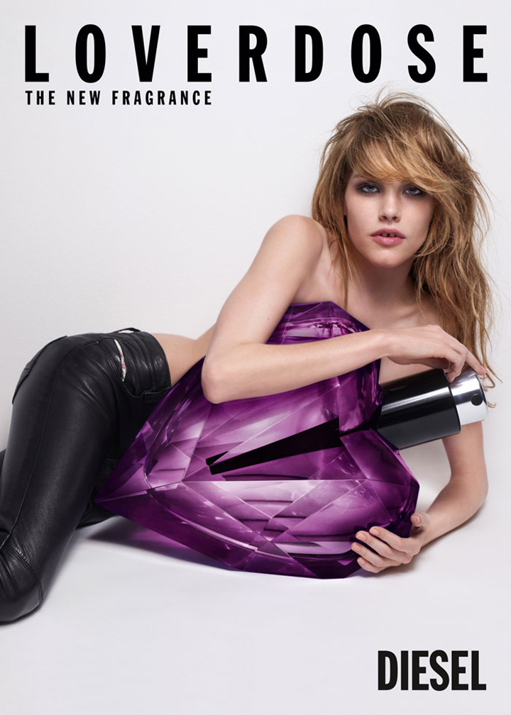
Diesel Loverdose- Campaign Advert - Analysing
The first advert I will be analysing is the Diesel 'loverdose' campaign.
The model is lying in a diagonal position, showing her figure and firmly holding the perfume on top of her because she is trying to look as if its a temptation which you need to work hard for, in order to get. The model's facial expression is intimidating and threatening as it makes you think twice about your body and your body features and she is also making eye contact in the first image but not in the other image, posing in a different way. The location of the advert starts in a cafe, this is an everyday typical location as the majority of the public spend their time in a cafe at lunch or in the morning. The mies-en-scene includes props like tables, tv, the blinds then carries out in the streets, the location is on the side of the road and other people are walking by then in a car, in a club and in a bedroom. The storyline for the advert is that the model sprays the perfume on her neck which symbolises attraction, then she walks in a cafe and the people in the cafe look at her in a attracted way, afterwards she looks at the TV in the cafe and the boxer on the TV looks at her which makes him feel vulnerable and weak once she comes out of the cafe she proceeds to her car and sees an officer giving her a ticket and as she gets closer he rips up the ticket. This then makes her feel superior and feels that perfume is her secret weapon and with that bottle of perfume she can get away with anything, whilst the audience feel they must have her power by buying themselves one of the Diesel ‘loverdose’ perfume. The costume used for the model is a grey pair of jeans with a black leather blazer and a grey baggy vest showing her chest with a black pair of high heels and a black bag showing her sophistication. The props used in the advert is the perfume which is in a diamond heart shaped bottle and the connotation of this is if anyone sprays it on their self, someone will instantly fall in love with that person. The props used in the video advert is the table in the cafe, the TV in the cafe, the car on the road is a connation of her being rich, super powerful and pretty this lets her park her car anywhere. The colour used in the poster advert is black, white, purplish pink to make the perfume stand out from the black and white background. The colours used in the video are sophisticated and elegant showing us that the people who use this perfume are elegant people. The name of the product is 'Loverdose' and the connotation is that spraying the perfume on you makes people addicted to you as it is called 'Loverdose.' The slogan for the product is 'THE NEW FRAGRANCE' and the connotation of that is that no other perfume smells like it, the choice of language is English because English is one of the most known language and the font type used for the product name and slogan is a normal/formal font to show formality. The camera shots used for advert picture one is medium shot from her head to her knees, for advert picture two the shot used is medium close up from her head to her shoulders. The audience is females aged 14-18+ because of the shape of the product which is a heart shape representing love. The income for the audience would be middle/high in come because the product looks very elegant and rich. The lifestyle choices for the audience would be fashion and magazines, and the Maslow audience type would be a succeeded.
Goffmans theory is when Superiority, Domination + Body Language when men are shown in dominated postitions and appear to be reflective of thought and intelligence, and women are shown in phsically potrayed in sexual or reclining poses with blank or inviting expressions. Dismemberment for Goffmans theory is when on females parts of the body such as legs, chest etc., are used rather than the full body. This is often applied to sell products which are not related to the body. The voice-over authority is when in moving image adverts, male voices are used as voice-overs in commercials rather than females.
Goffmans theory applies in my advert because it starts of showing the model's bum this connects to dismembermant because it is selling a perfume product by showing the models bum.
Goffmans theory applies in my advert because it starts of showing the model's bum this connects to dismembermant because it is selling a perfume product by showing the models bum.
Tuesday, 24 January 2012


Tuesday, 17 January 2012

Tuesday, 10 January 2012
<iframe width="560" height="315" src="http://www.youtube.com/embed/_ve4M4UsJQo" frameborder="0" allowfullscreen></iframe>

Subscribe to:
Posts (Atom)